Logo Design - Vegan For The Win™, 2013
Logo and social graphics for Vegan For The Win™, a vegan blog and graphics small biz. I was after a fresh, sun-kissed, and “California-y” look. It's live at http://www.veganforthewin.com.
For the Vegan For The Win™ brand, I wanted something fresh and “California-y.”
It's my own small venture, a blog and designs for t-shirts and merch for “vegans, the veg-positive, and the veg-curious” that came out of my change to a plant-based diet after a heart disease diagnosis at 36. (!)
Sunkist™ was a major inspiration.
After a lot of exploration, I went with Cooper Std Black as my fontface, and the green heart; since I was lead to veganism by way of my heart disease plant-power at the core seemed appropriate.
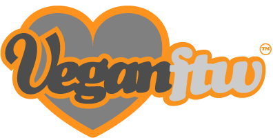
The other colors are ones I've always found appealling, and appropriate for something veg-oriented.
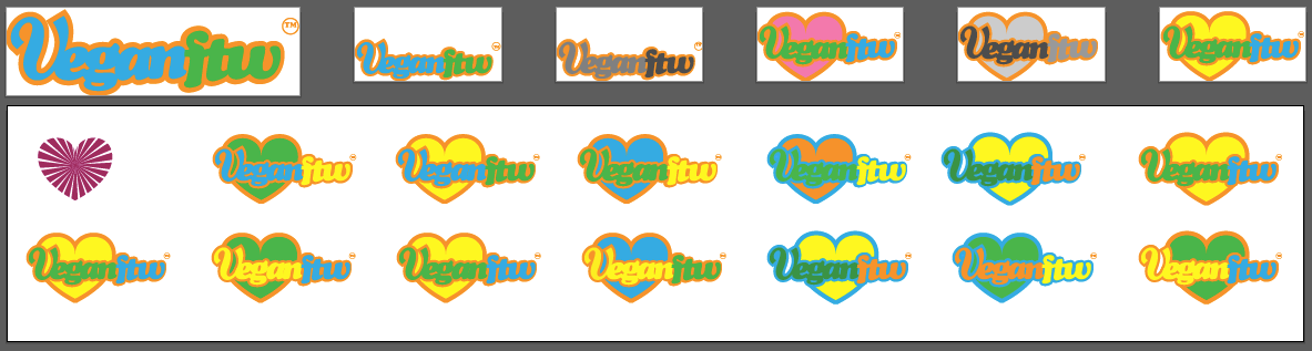
A snapshot of just a few of the many artboards worked on to develop the logo.
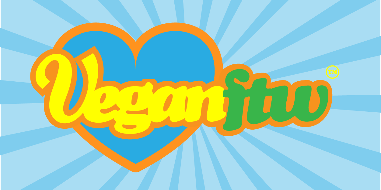
Final logo as seen on the site at http://www.veganforthewin.com.
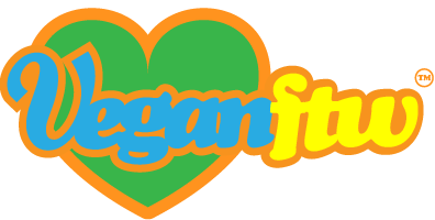
Alternate, rollover state for the logo at http://www.veganforthewin.com.
Squared version for avatars on Tumblr, Society6, Facebook, et al.
I off-centered the spokes of the green beams a bit.
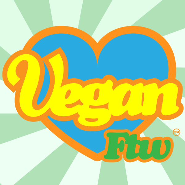
Twitter header photo. I allowed an alternate colorway.
I've since replaced it, but you can see here this still has some overlap between the “n” and the “f”, which was adjusted in the kerning for the final logo. The cross bars of the “f” and “t” were also merged to form a more appealing ligature.

Society6 storefront header.